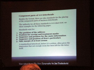
Mark Boulton Owner, Mark Boulton Design
Richard Rutter Production Dir, Clearleft Ltd
This was a good panel. Boulton and Rutter provided some good examples of how to improve online typography, addressing issues of typeface selection, creating vertical rhythm by establishing a relative line-height, and proper margins for lists (see above). These are great suggestions for me to incorporate with my Advanced students, subtle changes that will immediately improve the look of their sites. They provide resources at http://webtypography.net/sxsw2007/
Web Typography Sucks